로그인 버튼 컴포넌트
RP 시작 라우트 경로
아래 예시는 모두 /auth/logi/start 를 placeholder 로 사용합니다. 실제 경로는 RP 가 자체 결정합니다 (예: /auth/login, /sign-in, /api/auth/start). 자기 RP 의 OAuth 시작 라우트로 교체하세요.
logi SSO 버튼의 표준 사이즈 × 테마 조합. vanilla HTML + CSS variables — React/Vue/Svelte/Flutter 어느 스택에서도 복붙해서 색만 토큰으로 override 하면 그대로 동작합니다.
왜 vanilla 만 제공하나요
프레임워크별 NPM 패키지는 채택 데이터 본 후 Phase 2에 진행 예정입니다. 그 전에는 vanilla 가 모든 스택에서 동작하고, 디자인 변경 시 RP 가 한 줄로 token 만 바꿀 수 있어 가장 유연합니다.
QR 로그인 옵션은 logi 의 /oauth/authorize 페이지 안에 이미 통합돼 있어 별도 QR 버튼은 필요 없습니다 (QR 로그인 참고).
공통 CSS
한 번만 박아두면 아래 모든 사이즈가 동작합니다.
<style>
  :root {
    /* RP 가 자기 디자인 시스템에 맞춰 override 하세요 */
    --logi-button-bg:        #0F172A;  /* dark theme bg */
    --logi-button-fg:        #F8FAFC;  /* dark theme text */
    --logi-button-bg-light:  #FFFFFF;
    --logi-button-fg-light:  #0F172A;
    --logi-button-border:    rgba(15, 23, 42, 0.12);
    --logi-button-radius:    0;     /* Dcode 디자인 가이드: border-radius 0 기본 */
    --logi-button-font:      'SUIT Variable', -apple-system, "Segoe UI", sans-serif;
  }

  .logi-btn {
    display: inline-flex;
    align-items: center;
    justify-content: center;
    gap: 0.5rem;
    background: var(--logi-button-bg);
    color: var(--logi-button-fg);
    border: 1px solid var(--logi-button-border);
    border-radius: var(--logi-button-radius);
    font-family: var(--logi-button-font);
    font-weight: 600;
    text-decoration: none;
    cursor: pointer;
    transition: opacity 0.15s, transform 0.05s;
    user-select: none;
  }
  .logi-btn:hover  { opacity: 0.92; }
  .logi-btn:active { transform: scale(0.98); }

  .logi-btn--light {
    background: var(--logi-button-bg-light);
    color:      var(--logi-button-fg-light);
  }

  /* 사이즈 */
  .logi-btn--1x1 { width: 44px;  height: 44px; padding: 0; }
  .logi-btn--2x1 { height: 44px; padding: 0 1rem;          font-size: 0.9375rem; }
  .logi-btn--4x1 { height: 56px; padding: 0 1.5rem;        font-size: 1rem; width: 100%; }

  .logi-btn__logo { width: 20px; height: 20px; flex-shrink: 0; }
  .logi-btn--4x1 .logi-btn__logo { width: 24px; height: 24px; }

  /* 스타일 변형 — 취향 선택. 셋 다 지원하며 웹 문서의 기본 예시는 brand 다 */
  .logi-btn--brand   { background: linear-gradient(135deg, #0088FF, #0041E6); color: #FFFFFF; }
  .logi-btn--outline { background: transparent; color: inherit; border-color: var(--logi-button-border); }
</style>
브랜드 아이콘:
🔴 canonical:
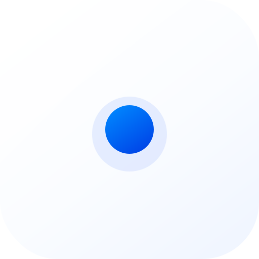
https://www.1pass.dev/icon.svg(공개 URL). 모든 surface (web / iOS / Android / Flutter) 공통. 과거 동심원 3개 SVG (<circle r="9">+r="4.5"+r="1.4">) 패턴은 폐기됨 (2026-05-19) — 브랜드 인지도 부족으로 RP 마다 logi 로 인식되지 않아 사용자 혼란 발생. 어떤 사이즈에서도 동심원 사용 금지.
# RP 통합 시 1회 다운로드 (자기 RP 의 정적 자산 위치로)
curl -o public/logi-icon.svg https://www.1pass.dev/icon.svg<!-- Web: 자기 RP 가 정적 호스팅하는 사본을 참조 -->
<img class="logi-btn__logo" src="/logi-icon.svg" alt="" aria-hidden="true" />실물 없이 참조만 넣으면 "조용히 빈 아이콘"이 됩니다
<img src="/logi-icon.svg"> 를 마크업에 넣었는데 정적 파일을 배치하지 않으면, SPA 폴백·인증 catch-all 이 그 경로를 가로채 302 리다이렉트나 HTML 을 돌려줍니다. <img> 는 404/302 에도 페이지를 깨뜨리지 않으므로 버튼의 아이콘 자리만 비어 있는 채 배포되고, 눈으로 보기 전까지 아무 에러도 없습니다 (2026-08-16 axhub 프로덕션 실측 — /logi-icon.svg → 302 → /login HTML).
배포 후 반드시 기계로 확인하세요:
curl -sI https://<your-rp>/logi-icon.svg | head -3
# 기대: HTTP 200 + content-type: image/svg+xml
# 302 또는 text/html 이 나오면 실물이 없는 것입니다

# 바이트까지 정본과 대조하려면:
curl -s https://<your-rp>/logi-icon.svg | md5
curl -s https://www.1pass.dev/icon.svg | md5   # 두 값이 같아야 함
네이티브 앱은 SVG 를 직접 못 씁니다 — 플랫폼별 자산 파이프라인 가이드:
| Surface | 가이드 |
|---|---|
| Web (HTML/CSS) | 이 페이지 아래 계속 |
| iOS (SwiftUI) | 로그인 버튼 — iOS |
| Android (Compose) | 로그인 버튼 — Android |
스타일 변형 — 취향으로 고르세요
세 가지 모두 지원합니다. 어느 것을 쓸지는 RP 의 취향이고, 이 문서(웹)의 기본 예시는 브랜드 블루, 앱 가이드(iOS · Android)의 기본 예시는 아웃라인입니다.
 logi 로 로그인
 | 변형 | 클래스 | 라이트/다크 거동 |
|---|---|---|
| 브랜드 블루 (웹 기본 예시) | logi-btn--brand | 양 모드 동일 — 아이콘 dot 그라디언트(#0088FF→#0041E6)에서 취색 |
| 반전형 (종전 기본) | logi-btn / 다크 배경 위 logi-btn--light | 라이트=네이비, 다크=화이트로 반전 |
| 뉴트럴 아웃라인 (앱 기본 예시) | logi-btn--outline | 캔버스 표면 + 보더 — 다른 SSO 버튼과 나란히 둘 때 존재감 균형 |
1x1 — 아이콘 전용 (44×44)
사이드바 / FAB / 모바일 헤더 / 액션바 같이 좁은 공간 — 텍스트 없이 로고만.
<a href="/auth/logi/start" class="logi-btn logi-btn--1x1 logi-btn--brand" aria-label="logi 로 로그인">
  <img class="logi-btn__logo" src="/logi-icon.svg" alt="" aria-hidden="true" />
</a>
접근성
1x1 버튼은 텍스트가 없으므로 aria-label="logi 로 로그인" 필수. 스크린리더가 의미 전달 못 하면 WCAG 2.1 4.1.2 위반.
2x1 — 인라인 (220×44)
로그인 폼 하단 / 모달 footer / "다른 방법으로 로그인" 옵션 묶음.
<a href="/auth/logi/start" class="logi-btn logi-btn--2x1 logi-btn--brand">
  <img class="logi-btn__logo" src="/logi-icon.svg" alt="" aria-hidden="true" />
  logi 로 로그인
</a>
4x1 — Hero (full-width × 56)
메인 로그인 페이지의 primary CTA. 한 줄을 통째로 차지.
<a href="/auth/logi/start" class="logi-btn logi-btn--4x1 logi-btn--brand">
  <img class="logi-btn__logo" src="/logi-icon.svg" alt="" aria-hidden="true" />
  logi 로 로그인
</a>
디자인 토큰 override 예시
RP 의 디자인 시스템에 맞추기:
/* Tailwind 프로젝트 */
:root {
  --logi-button-bg:     theme('colors.indigo.600');
  --logi-button-fg:     theme('colors.white');
  --logi-button-radius: theme('borderRadius.md');
}

/* shadcn/ui */
:root {
  --logi-button-bg:     hsl(var(--primary));
  --logi-button-fg:     hsl(var(--primary-foreground));
  --logi-button-radius: var(--radius);
}

/* Bootstrap */
:root {
  --logi-button-bg:     var(--bs-primary);
  --logi-button-fg:     #fff;
  --logi-button-radius: var(--bs-border-radius);
}
프레임워크 인라인 (참고용)
React / JSX
// variant: "brand"(웹 기본 예시) | ""(반전형 dark) | "light" | "outline"
function LogiButton({ size = "2x1", variant = "brand", href = "/auth/logi/start" }) {
  return (
    <a href={href} className={`logi-btn logi-btn--${size} ${variant ? `logi-btn--${variant}` : ""}`}
       aria-label="logi 로 로그인">
      <img className="logi-btn__logo" src="/logi-icon.svg" alt="" aria-hidden="true" />
      {size !== "1x1" && "logi 로 로그인"}
    </a>
  );
}
Svelte
<script>
  // variant: "brand"(웹 기본 예시) | ""(반전형 dark) | "light" | "outline"
  let { size = "2x1", variant = "brand", href = "/auth/logi/start" } = $props();
</script>

<a {href} class="logi-btn logi-btn--{size} {variant ? `logi-btn--${variant}` : ''}"
   aria-label="logi 로 로그인">
  <img class="logi-btn__logo" src="/logi-icon.svg" alt="" aria-hidden="true" />
  {#if size !== "1x1"}logi 로 로그인{/if}
</a>
Flutter (logi_button.dart)
별도 SDK 패키지로 분리 예정. 그 사이엔 flutter_web_auth_2 + IconButton/ElevatedButton 으로 위 사이즈 매트릭스를 직접 구성하세요. 색상은 Theme.of(context).colorScheme.primary 를 따르도록.
브랜드 가이드
| 항목 | 규칙 |
|---|---|
| 텍스트 | 한국어: "logi 로 로그인" / 영문: "Sign in with logi" / 일본어: "logi でログイン" |
| 로고 | /icon.svg (그라디언트 dot) — 그대로 사용. 변형 / 회전 / 색 분해 / 동심원 substitute ❌ |
| 최소 사이즈 | 32×32px (이보다 작으면 로고 식별 어려움) |
| 클리어 영역 | 버튼 둘레 = 로고 1/2 폭 만큼 비워두기 |
| 색 대비 | WCAG AA 4.5:1 이상 (light/dark 토큰 그대로 쓰면 충족) |
다음 (예정)
- NPM 패키지
@logi-auth/button-react/@logi-auth/button-vue/@logi-auth/button-svelte— 채택 데이터 보고 Phase 2 - CDN CSS
https://api.1pass.dev/buttons.css—<link rel="stylesheet">한 줄 통합 - Figma library — 디자이너 협업용